Nicklaus Children's Hospital /
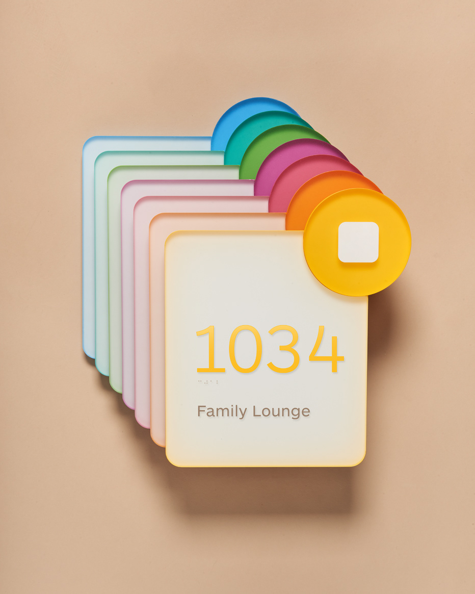
A language neutral visual vocabulary that carefully synthesizes three key attributes the hospital embraces: technology, friendliness, and universality – and a design system that easily moves people across a diverse landscape of interior and exterior space – was created for Nicklaus Children’s Hospital in Miami, Florida. Our solution creates a physical “interface” in the built environment reminiscent of buttons and shapes in digital user interface design. The design language (color, typography, form, organization) were adopted for other technologies within the hospital system.




Interior wayfinding /
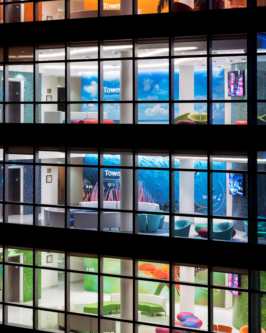
Upon arrival, visitors are met with a similar design program: bright colors, simple iconography and large, dimensional lettering that echo the exterior. Wall plaques that are adjacent to the elevator bays pick up the icon system, letting visitors know where they are in relation to other paths.
Exterior wayfinding /
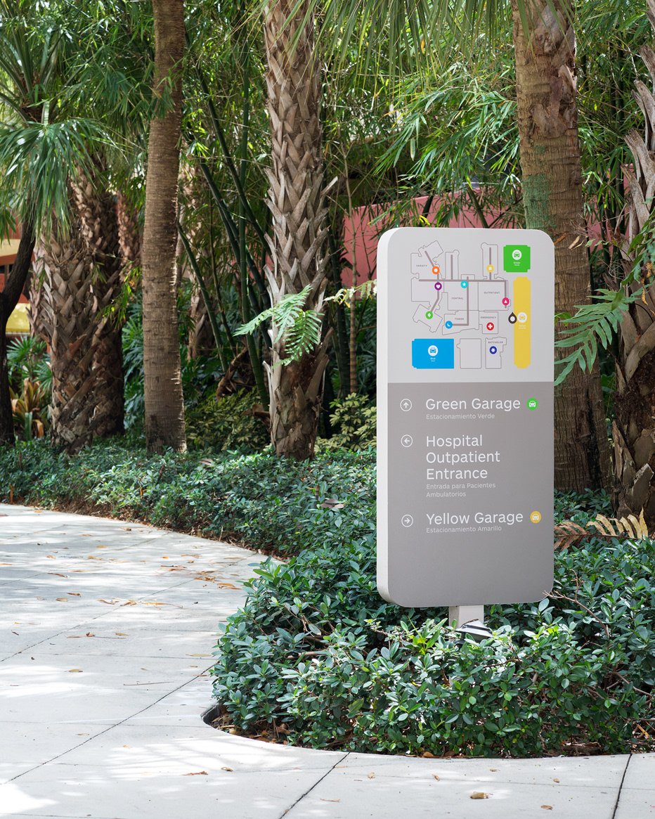
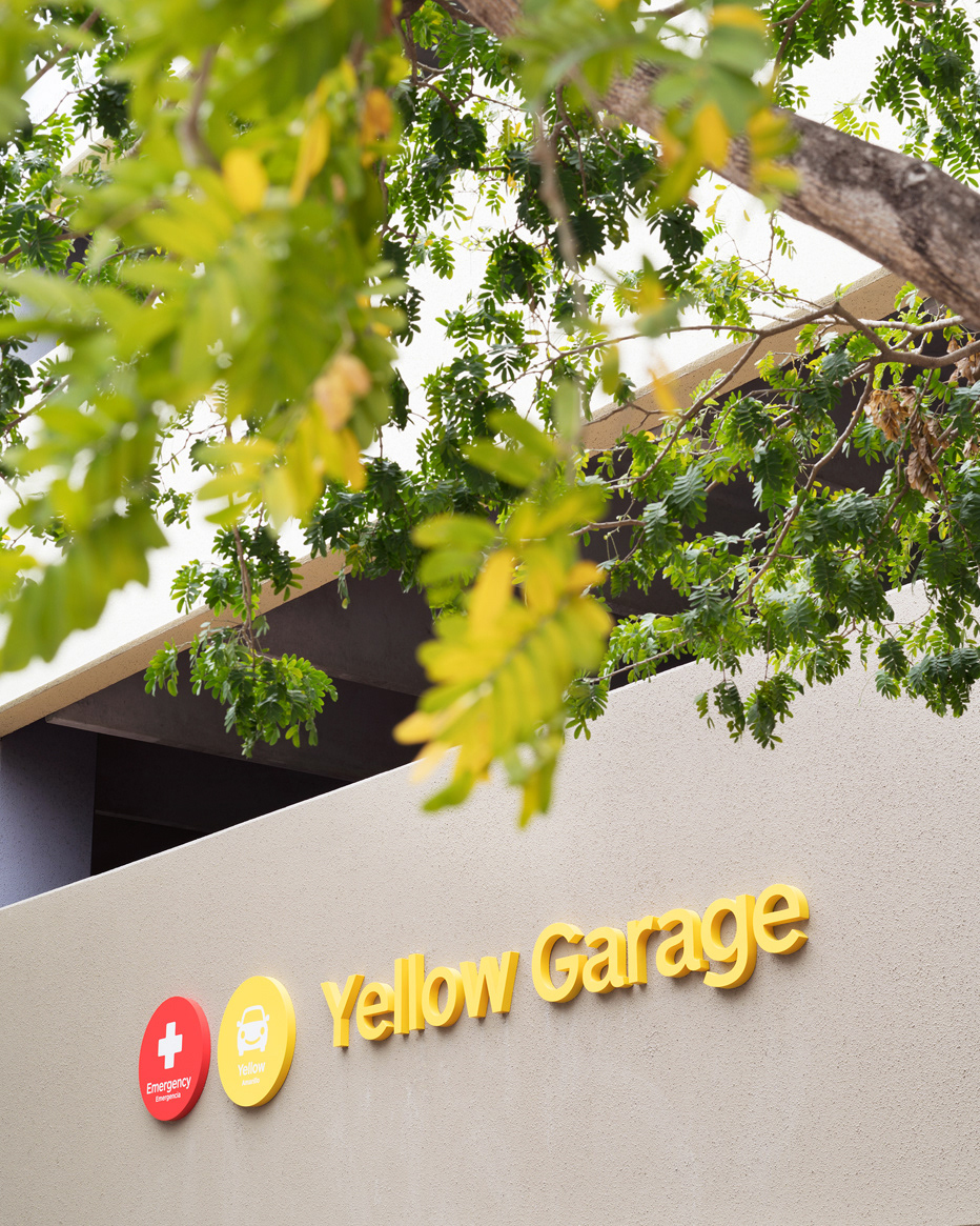
Exterior overhead directional signs guide visitors to the appropriate garage, informing visitors of their current position while guiding them the appropriate destination. Since the campus is made up of large, outdoor spaces, we created pedestrian directionals that integrate into the surroundings, guiding visitors to the appropriate entrance.